
How the Dumb Design of a WWII Plane Led to the Macintosh
By Cliff Kuang
Silent Reaper
At first, pilots took the blame for crashes. The true cause, however, lay with the design. That lesson led us into our user-friendly age—but there's peril to come.
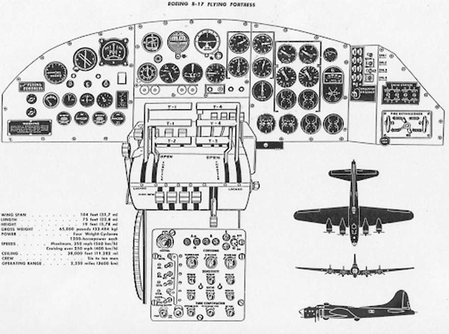
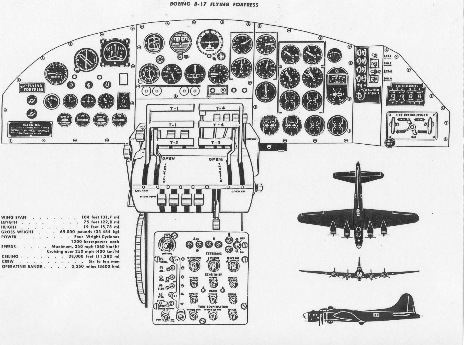
The B-17 Flying Fortress rolled off the drawing board and onto the runway in a mere 12 months, just in time to become the fearsome workhorse of the US Air Force during World War II. Its astounding toughness made pilots adore it: The B-17 could roar through angry squalls of shrapnel and bullets, emerging pockmarked but still airworthy. It was a symbol of American ingenuity, held aloft by four engines, bristling with a dozen machine guns.
Imagine being a pilot of that mighty plane. You know your primary enemy—the Germans and Japanese in your gunsights. But you have another enemy that you can’t see, and it strikes at the most baffling times. Say you’re easing in for another routine landing. You reach down to deploy your landing gear. Suddenly, you hear the scream of metal tearing into the tarmac. You’re rag-dolling around the cockpit while your plane skitters across the runway. A thought flickers across your mind about the gunners below and the other crew: "Whatever has happened to them now, it’s my fault." When your plane finally lurches to a halt, you wonder to yourself: "How on earth did my plane just crash when everything was going fine? What have I done?"
For all the triumph of America’s new planes and tanks during World War II, a silent reaper stalked the battlefield: accidental deaths and mysterious crashes that no amount of training ever seemed to fix. And it wasn’t until the end of the war that the Air Force finally resolved to figure out what had happened.

Designer Error
To do that, the Air Force called upon a young psychologist at the Aero Medical Laboratory at Wright-Patterson Air Force Base near Dayton, Ohio. Paul Fitts was a handsome man with a soft Tennessee drawl, analytically minded but with a shiny wave of Brylcreemed hair, Elvis-like, which projected a certain suave nonconformity. Decades later, he’d become known as one of the Air Force’s great minds, the person tasked with hardest, weirdest problems—such as figuring out why people saw UFOs.
For now though, he was still trying to make his name with a newly minted PhD in experimental psychology. Having an advanced degree in psychology was still a novelty; with that novelty came a certain authority. Fitts was supposed to know how people think. But his true talent is to realize that he doesn’t.
When the thousands of reports about plane crashes landed on Fitts’s desk, he could have easily looked at them and concluded that they were all the pilot’s fault—that these fools should have never been flying at all. That conclusion would have been in keeping with the times. The original incident reports themselves would typically say “pilot error,” and for decades no more explanation was needed. This was, in fact, the cutting edge of psychology at the time. Because so many new draftees were flooding into the armed forces, psychologists had begun to devise aptitude tests that would find the perfect job for every soldier. If a plane crashed, the prevailing assumption was: That person should not have been flying the plane. Or perhaps they should have simply been better trained. It was their fault.
But as Fitts pored over the Air Force’s crash data, he realized that if “accident prone” pilots really were the cause, there would be randomness in what went wrong in the cockpit. These kinds of people would get hung on anything they operated. It was in their nature to take risks, to let their minds wander while landing a plane. But Fitts didn’t see noise; he saw a pattern. And when he went to talk to the people involved about what actually happened, they told of how confused and terrified they’d been, how little they understood in the seconds when death seemed certain.
The examples slid back and forth on a scale of tragedy to tragicomic: pilots who slammed their planes into the ground after misreading a dial; pilots who fell from the sky never knowing which direction was up; the pilots of B-17s who came in for smooth landings and yet somehow never deployed their landing gear. And others still, who got trapped in a maze of absurdity, like the one who, having jumped into a brand-new plane during a bombing raid by the Japanese, found the instruments completely rearranged. Sweaty with stress, unable to think of anything else to do, he simply ran the plane up and down the runway until the attack ended.
Fitts' data showed that during one 22-month period of the war, the Air Force reported an astounding 457 crashes just like the one in which our imaginary pilot hit the runway thinking everything was fine. But the culprit was maddeningly obvious for anyone with the patience to look. Fitts' colleague Alfonse Chapanis did the looking. When he started investigating the airplanes themselves, talking to people about them, sitting in the cockpits, he also didn’t see evidence of poor training. He saw, instead, the impossibility of flying these planes at all. Instead of “pilot error,” he saw what he called, for the first time, “designer error.”
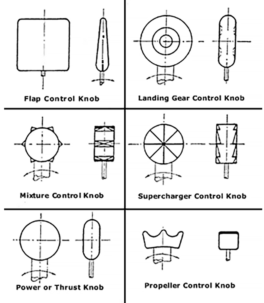
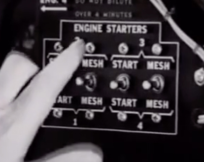
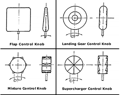
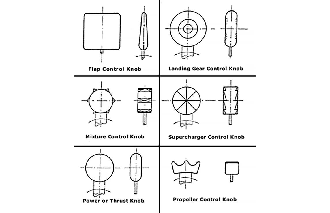
The reason why all those pilots were crashing when their B-17s were easing into a landing was that the flaps and landing gear controls looked exactly the same. The pilots were simply reaching for the landing gear, thinking they were ready to land. And instead, they were pulling the wing flaps, slowing their descent, and driving their planes into the ground with the landing gear still tucked in. Chapanis came up with an ingenious solution: He created a system of distinctively shaped knobs and levers that made it easy to distinguish all the controls of the plane merely by feel, so that there’s no chance of confusion even if you’re flying in the dark.
"They told of how confused and terrified they’d been, how little they understood in the seconds when death seemed certain."
"Instead of “pilot error,” he saw what he called, for the first time, 'designer error.'”
Designing for the Everyday
By law, that ingenious bit of design—known as shape coding—still governs landing gear and wing flaps in every airplane today. And the underlying idea is all around you: It’s why the buttons on your video game controller are differently shaped, with subtle texture differences so you can tell which is which. It’s why the dials and knobs in your car are all slightly different, depending on what they do. And it’s the reason your virtual buttons on your smartphone adhere to a pattern language.
But Chapanis and Fitts were proposing something deeper than a solution for airplane crashes. Faced with the prospect of soldiers losing their lives to poorly designed machinery, they invented a new paradigm for viewing human behavior. That paradigm lies behind the user-friendly world that we live in every day. They realized that it was absurd to train people to operate a machine and assume they would act perfectly under perfect conditions.
Instead, designing better machines meant figuring how people acted without thinking, in the fog of everyday life, which might never be perfect. You couldn’t assume humans to be perfectly rational sponges for training. You had to take them as they were: distracted, confused, irrational under duress. Only by imagining them at their most limited could you design machines that wouldn’t fail them.
Teaching Tech About Humans
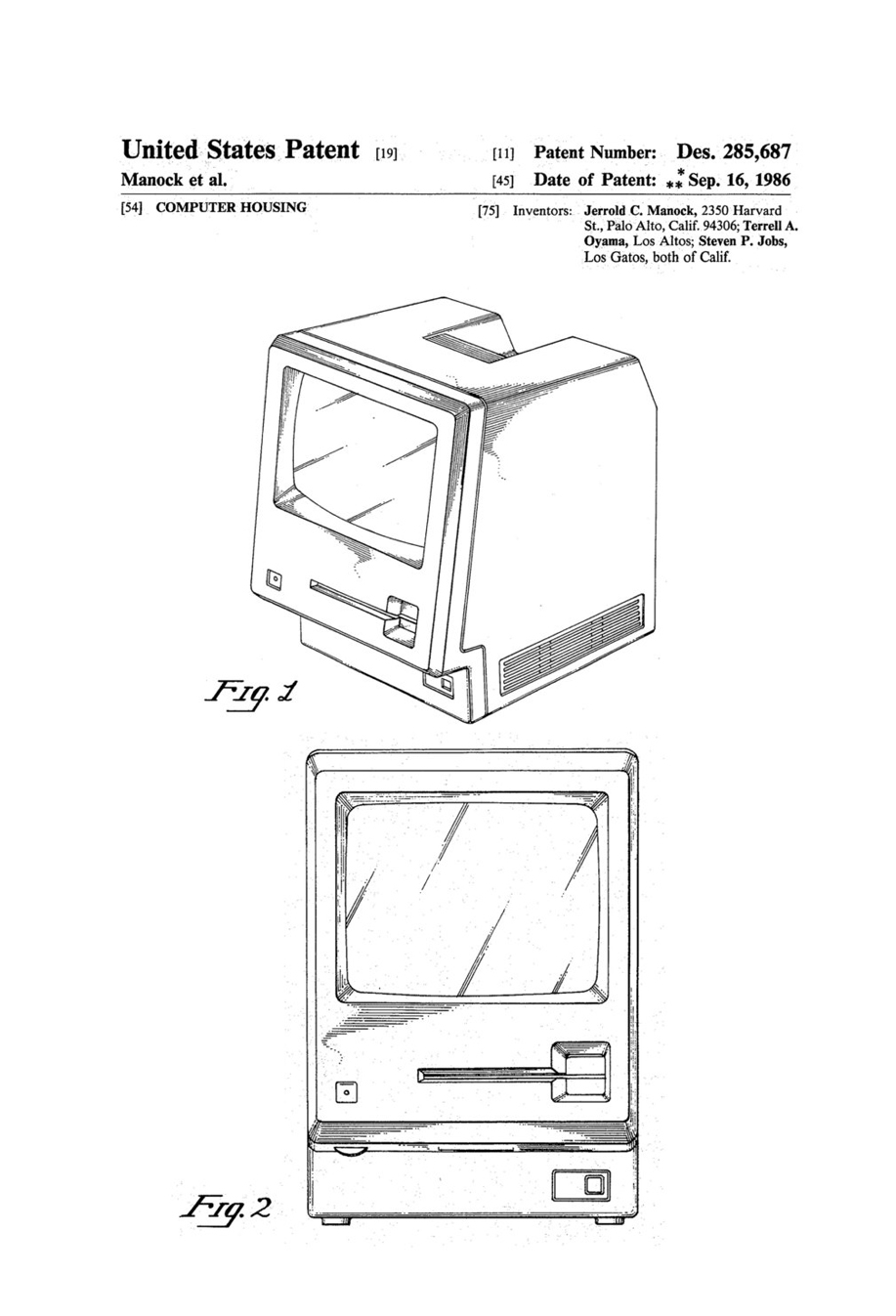
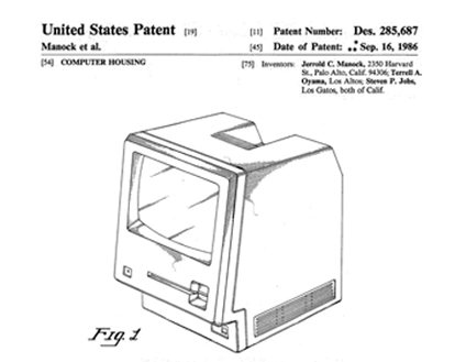
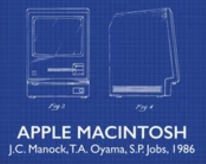
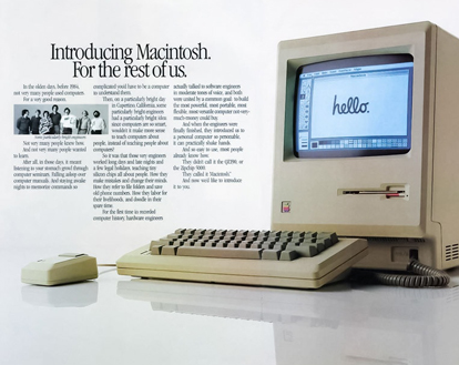
This new paradigm took root slowly at first. But by 1984—four decades after Chapanis and Fitts conducted their first studies—Apple was touting a computer for the rest of us in one of its first print ads for the Macintosh: "On a particularly bright day in Cupertino, California, some particularly bright engineers had a particularly bright idea: Since computers are so smart, wouldn’t it make sense to teach computers about people, instead of teaching people about computers? So it was that those very engineers worked long days and nights and a few legal holidays, teaching silicon chips all about people. How they make mistakes and change their minds. How they refer to file folders and save old phone numbers. How they labor for their livelihoods, and doodle in their spare time." (Emphasis mine.) And that easy-to-digest language molded the smartphones and seamless technology we live with today.
Along the long and winding path to a user-friendly world, Fitts and Chapanis laid the most important brick. They realized that as much as humans might learn, they would always be prone to err—and they inevitably brought presuppositions about how things should work to everything they used. This wasn’t something you could teach of existence. In some sense, our limitations and preconceptions are what it means to be human—and only by understanding those presumptions could you design a better world.
Today, this paradigm shift has produced trillions in economic value. We now presume that apps that reorder the entire economy should require no instruction manual at all; some of the most advanced computers ever made now come with only cursory instructions that say little more than "turn it on." This is one of the great achievements of the last century of technological progress, with a place right alongside GPS, Arpanet, and the personal computer itself.
It's also an achievement that remains unappreciated because we assume this is the way things should be. But with the assumption that even new technologies need absolutely no explaining comes a dark side: When new gadgets make assumptions about how we behave, they force unseen choices upon us. They don’t merely defer to our desires. They shape them.
"As much as humans might learn, they would always be prone to err—and they inevitably brought presuppositions about how things should work to everything they used.”

User-Friendliness
User friendliness is simply the fit between the objects around us and the ways we behave. So while we might think that the user-friendly world is one of making user-friendly things, the bigger truth is that design doesn’t rely on artifacts; it relies on our patterns. The truest material for making new things isn’t aluminum or carbon fiber. It’s behavior. And today, our behavior is being shaped and molded in ways both magical and mystifying, precisely because it happens so seamlessly.
I got a taste of this seductive, user-friendly magic recently, when I went to Miami to tour a full-scale replica of Carnival Cruise's so-called Ocean Medallion experience. I began my tour in a fake living room, with two of the best-looking project staffers pretending to be husband and wife, showing me how the whole thing was supposed to go.
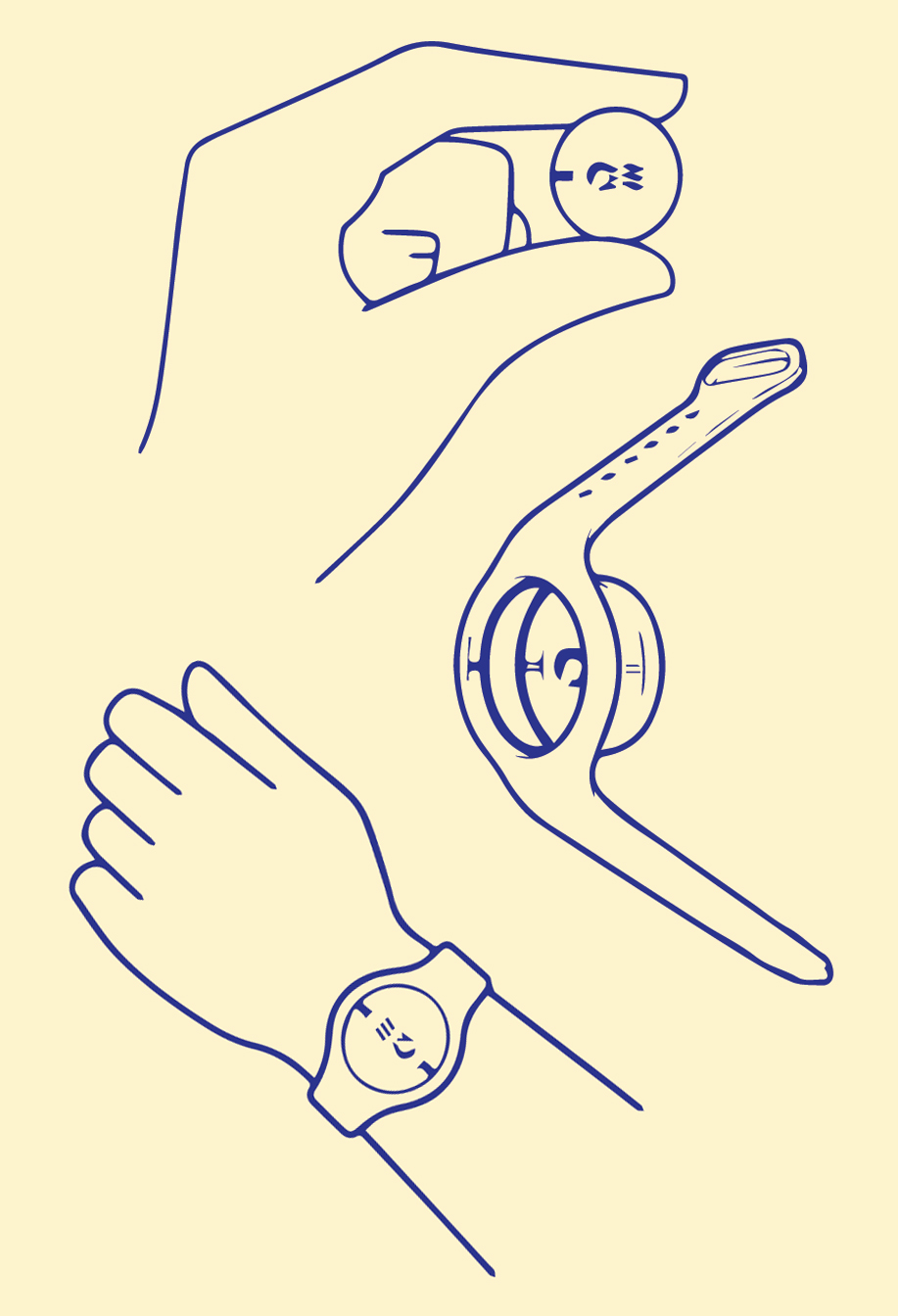
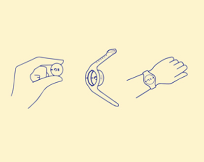
Using the app, you could reserve all your activities way before you boarded the ship. And once on board, all you needed was to carry was a disk the size of a quarter; using that, any one of the 4,000 touchscreens on the ship could beam you personalized information, such which way you needed to go for your next reservation. The experience recalled not just scenes from Her and Minority Report, but computer-science manifestos from the late 1980s that imagined a suite of gadgets that would adapt to who you are, morphing to your needs in the moment.
Behind the curtains, in the makeshift workspace, a giant whiteboard wall was covered with a sprawling map of all the inputs that flow into some 100 different algorithms that crunch every bit of a passenger’s preference behavior to create something called the “Personal Genome.” If Jessica from Dayton wanted sunscreen and a mai tai, she could order them on her phone, and a steward would deliver them in person, anywhere across the sprawling ship.
The server would greet Jessica by name, and maybe ask if she was excited about her kitesurfing lesson. Over dinner, if Jessica wanted to plan an excursion with friends, she could pull up her phone and get recommendations based on the overlapping tastes of the people she was sitting with. If only some people like fitness and others love history, then maybe they’ll all like a walking tour of the market at the next port.
Jessica’s Personal Genome would be recalculated three times a second by 100 different algorithms using millions of data points that encompassed nearly anything she did on the ship: How long she lingered on a recommendation for a sightseeing tour; the options that she didn’t linger on at all; how long she’d actually spent in various parts of the ship; and what’s nearby at that very moment or happening soon. If, while in her room, she had watched one of Carnival’s slickly produced travel shows and seen something about a market tour at one her ports of call, she’d later get a recommendation for that exact same tour when the time was right. “Social engagement is one of the things being calculated, and so is the nuance of the context,” one of the executives giving me the tour said.
It was like having a right-click for the real world. Standing on the mocked-up sundeck, knowing that whatever I wanted would find me, and that whatever I might want would find its way either onto the app or the screens that lit up around the cruise ship as I walked around, it wasn’t hard to see how many other businesses might try to do the same thing. In the era following World War II, the idea that designers could make the world easier to understand was a breakthrough.
"Our behavior is being shaped and molded in ways both magical and mystifying, precisely because it happens so seamlessly.”

Unthinking
But today, “I understand what I should do” has become “I don’t need to think at all.” For businesses, intuitiveness has now become mandatory, because there are fortunes to be made by making things just a tad more frictionless. “One way to view this is creating this kind of frictionless experience is an option. Another way to look at it is that there’s no choice,” said John Padgett, the Carnival executive who had shepherded the Ocean Medallion to life. “For millennials, value is important. But hassle is more important, because the era they’ve grow up in. It’s table stakes. You have to be hassle-free to get them to participate.”
The Market of One
By that logic, the real world was getting to be disappointing when compared with the frictionless ease of this increasingly virtual world. Taken as a whole, Carnival’s vision for seamless customer service that can anticipate your every whim was like an Uber for everything, powered by Netflix recommendations for meatspace. And these are in fact the experiences that many more designers will soon be striving for: invisible, everywhere, perfectly tailored, with no edges between one place and the next. Padgett described this as a “market of one,” in which everything you saw would be only the thing you want.
The Market of One suggests to me a break point in the very idea of user friendliness. When Chapanis and Fitts were laying the seeds of the user-friendly world, they had to find the principles that underlie how we expect the world to behave. They had to preach the idea that products built on our assumptions about how things should work would eventually make even the most complex things easy to understand.
Friction and Introspection
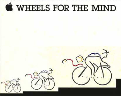
Steve Jobs’ dream of a “bicycle for the mind”—a universal tool that might expand the reach of anyone—has arrived. High technology has made our lives easier; made us better at our jobs, and created jobs that never existed before; it has made the people we care about closer to us. But friction also has value: It’s friction that makes us question whether we do in fact need the thing we want. Friction is the path to introspection. Infinite ease quickly becomes the path of least resistance; it saps our free will, making us submit to someone else’s guess about who we are. We can’t let that pass. We have to become cannier, more critical consumers of the user-friendly world. Otherwise, we risk blundering into more crashes that we’ll only understand after the worst has already happened.
"Friction is the path to introspection. Infinite ease quickly becomes the path of least resistance.”


